tlooto
注册

Create a clear, publication-ready figure that visualizes the correlation between temperature and plant growth over time

Create a clear, publication-ready figure that visualizes the correlation between temperature and plant growth over time

2025年10月29日 04:36

A publication-ready line graph illustrating the relationship between temperature and plant growth over time.
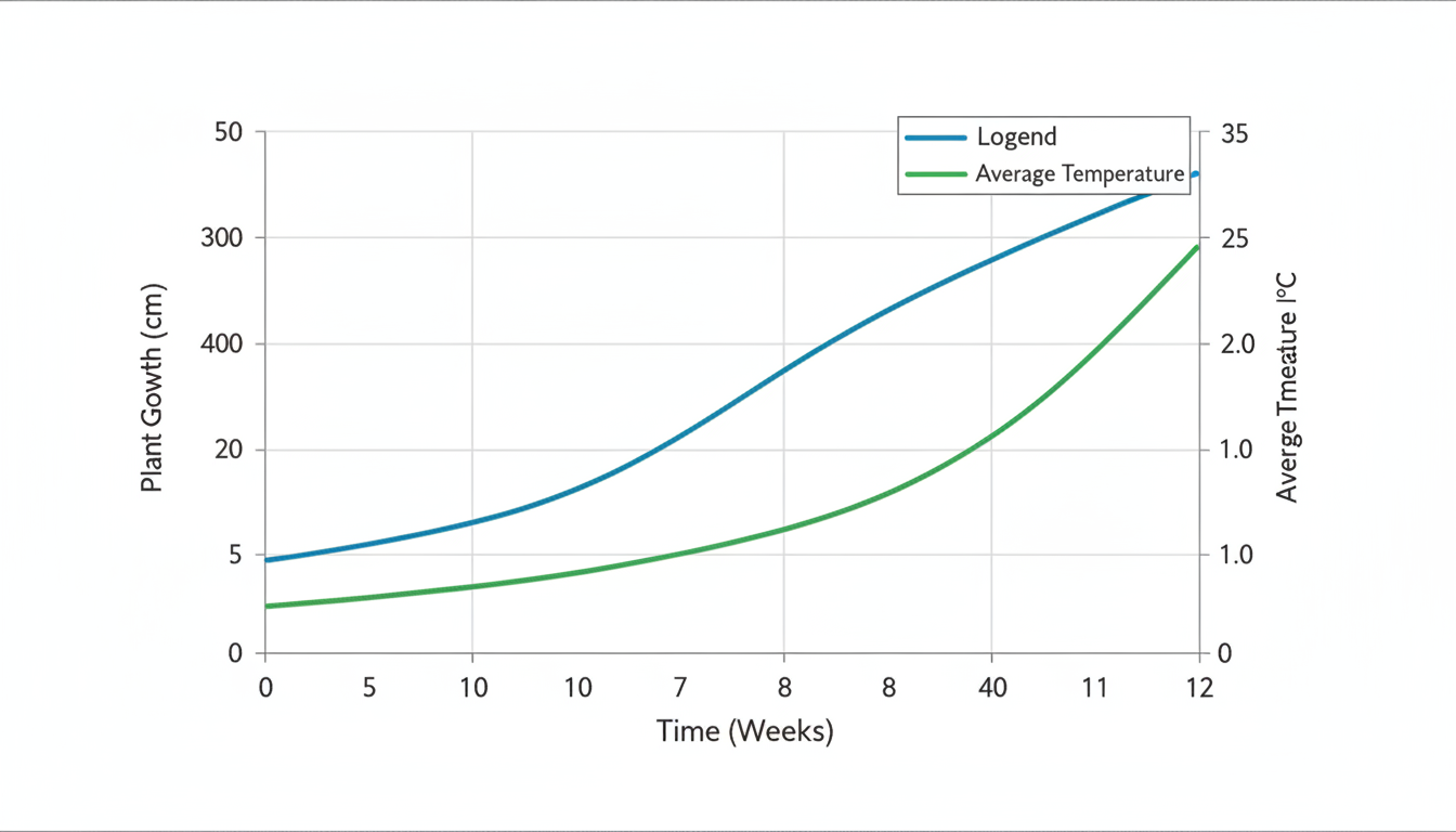
  • X-axis: Represents 'Time (Weeks)' from 0 to 12.
  • Left Y-axis: Shows 'Plant Growth (cm)' from 0 to 50.
  • Right Y-axis: Displays 'Average Temperature (°C)' from 10 to 35.
  • Data Lines: Two distinct lines, one blue for temperature and one green for plant growth, showing their correlation and trends over the 12-week period.
  • Aesthetics: Clean, minimalist, high-resolution, with clear labels and a legend, suitable for academic publication.
生成的文件
  • 294b222590ae49239718238b15865a6b.png

    生成的文件

2025年10月29日 04:36

Create a clear, publication-ready figure that visualizes the correlation between temperature and plant growth over time

2025年10月29日 04:36

A dual-axis line graph illustrating the relationship between temperature and plant growth over time.
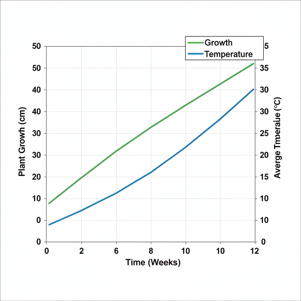
  • X-axis: Represents 'Time (Weeks)' from 0 to 12.
  • Left Y-axis: Shows 'Plant Growth (cm)' from 0 to 50.
  • Right Y-axis: Displays 'Average Temperature (°C)' from 10 to 35.
  • Data Lines: Two distinct lines, one green for plant growth and one blue for average temperature, showing their positive correlation and trends over the 12-week period.
  • Aesthetics: Clean, minimalist, high-resolution, with clear labels and a legend, suitable for academic publication.
生成的文件
  • 6e63f2328caa4b1c82caffa01a163a4d.png

    生成的文件

2025年10月29日 04:36

Create a clear, publication-ready figure that visualizes the correlation between temperature and plant growth over time

2025年10月29日 04:37

A publication-ready dual-axis line graph illustrating the relationship between temperature and plant growth over time.
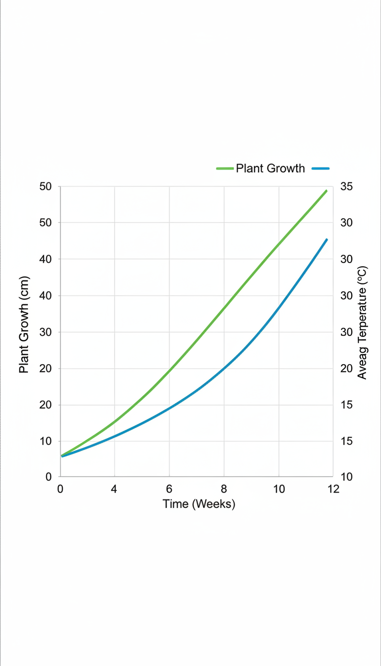
  • X-axis: Represents 'Time (Weeks)' from 0 to 12.
  • Left Y-axis: Shows 'Plant Growth (cm)' from 0 to 50.
  • Right Y-axis: Displays 'Average Temperature (°C)' from 10 to 35.
  • Data Lines: Two distinct lines, one green for plant growth and one blue for average temperature, showing their positive correlation and trends over the 12-week period.
  • Aesthetics: Clean, minimalist, high-resolution, with clear labels and a legend, suitable for academic publication.
生成的文件
  • c578da214e1a40f3b67eabce97df58a7.png

    生成的文件

2025年10月29日 04:37

tlooto 可能会出错。请对照原始来源核对重要信息。